

Estimated reading time: 8 minutes
The Starting Point: A Conference Room That Killed the Energy
Walk into most youth conference rooms and you’ll find the same scene: white walls, folding chairs, a projector screen, and nothing else. Functional, yes — but the moment young speakers and attendees step in, the energy flatlines. Take a typical two-day STEM conference for participants aged 16 to 30 as an example. The goal in a room like this is clear: the space needs to feel ambitious, creative, and worthy of the ideas being discussed inside it. Young people are visually literate. They notice when a room has been designed with intention — and they notice just as quickly when it hasn’t. The walls were the problem. Bare surfaces send an unspoken message: nothing remarkable happens here. The first lever to pull in any conference or event room transformation is the walls. Before furniture, before lighting adjustments, before branded signage — wall art for office and event environments sets the psychological tone of the entire space. It is the fastest, most cost-effective way to signal purpose and energy to every person who walks through the door.
Choosing the Right Wall Art for a Youth Conference Room
Not all art works in a professional setting aimed at younger audiences. The selection process starts with understanding what resonates — and what reads as generic or out of touch.
Art styles that consistently land well with audiences between 16 and 30 include:
- Bold typographic prints — single words or short phrases rendered in strong, clean typefaces. Think “Create”, “Build”, “Lead” at scale.
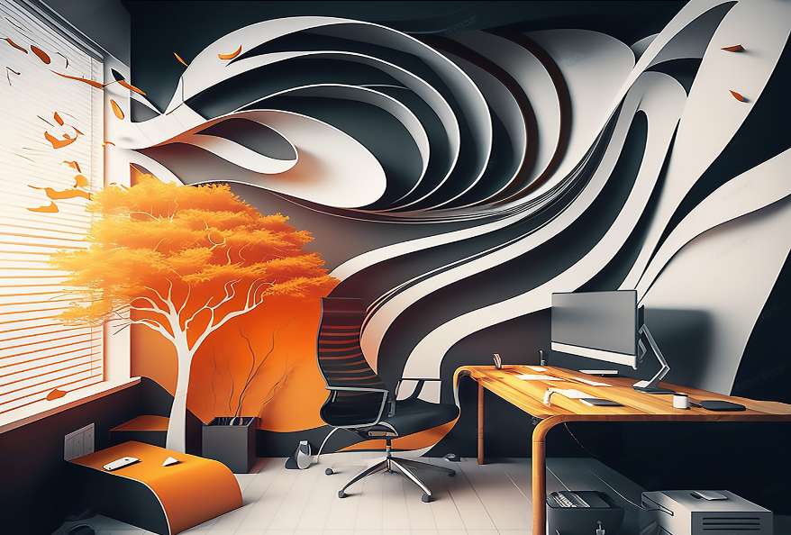
- Abstract geometric compositions — shapes, gradients, and layered forms that feel modern without being literal.
- Urban and architectural photography — black-and-white cityscapes or close-up structural details that project ambition.
- Minimalist motivational prints — a single line of text on a clean background, framed intentionally.
Wall art for office environments carries a different responsibility than purely decorative home pieces. It needs to sustain attention over hours, not just catch the eye for a moment. That means choosing pieces with a clear visual hierarchy: one dominant hero piece that anchors the room, supported by a curated secondary set rather than a random collection of prints.

For a room like this, browsing motivational office wall art prints helps identify pieces that balance visual weight with professional restraint, before settling on one hero piece and a coherent set for the side walls.
Sizing and Format: How Large Should the Artwork Be?
In a conference or event room, artwork that is too small simply disappears. The rule of thumb for any focal wall is that the hero piece should span 60 to 75 percent of the wall’s width. For a standard 4-meter wall, that translates to a print of at least 120 cm wide — and ideally closer to 140 cm.
Calculating the right size involves two variables: wall width and the distance from which most attendees will view the piece. Seating arranged 3 to 5 meters from the speaker wall calls for larger formats. Closer breakout configurations can work with slightly smaller pieces, but scale should always err on the side of bold rather than timid.
Format choices matter as much as dimensions:
- Single oversized canvas — maximum visual impact, best for the speaker wall behind a podium or presentation screen.
- Diptych or triptych sets — three coordinated prints hung horizontally create a cinematic effect ideal for long side walls.
- Structured gallery wall — a grid of five to nine prints in matching frames works well on a large blank wall, provided the sizing and spacing are consistent.
Horizontal orientations dominate in conference settings because they mirror the natural sweep of a viewer’s gaze across a wide room. Vertical prints work better in narrower alcoves or beside doorways. For the speaker wall specifically, a wide horizontal canvas or a horizontal triptych keeps the visual energy moving outward — reinforcing the sense of openness and possibility.
Recommended large-format sizes for conference rooms: 100 × 140 cm for a single hero piece, or three panels at 60 × 80 cm each for a triptych arrangement.
Frames, Finishes, and Materials: Making the Art Look Professional
The difference between a print that looks intentional and one that looks like an afterthought often comes down to the frame. In a professional event space, framing is not optional — it is a signal of quality that young attendees read immediately, even unconsciously.
Framed prints in a consistent finish communicate that the space was designed, not assembled. For youth conference rooms, clean black frames are the most versatile choice: they complement bold typographic art, contrast well against white or light grey walls, and photograph sharply — which matters when attendees share images on social media. Natural wood frames work equally well in warmer, more collaborative environments.
Canvas wraps (where the print extends around the edges of a stretcher frame) are a strong alternative for oversized hero pieces. They eliminate the need for a frame entirely and give large-format motivational art a gallery-quality presence that reads as premium without being formal.
On finish: matte surfaces consistently outperform gloss in conference room conditions. LED ceiling lights and spotlights create glare on gloss prints, making text-based or detailed artwork difficult to read from a distance. Matte finishes absorb light evenly and remain legible across the full seating area.
For event spaces where artwork may be transported and reused across multiple venues, ready-to-hang framed prints with reinforced hanging hardware are the practical choice — no specialist installation required, no damage risk during transit.
Also Read: STEM Conference For Beginners Showcasing Your Research Online
Placement and Hanging: Where to Put the Art for Maximum Impact
Strategic placement amplifies the investment in good artwork. In a conference room, there is a clear hierarchy of wall real estate.
The speaker wall is the primary focal point. Every photograph taken during the event, every video clip shared afterward, every screen capture from a live stream — all of them include this wall as background. Art placed here reaches an audience far beyond the room itself. A large abstract motivational canvas or a bold typographic print positioned behind the speaker’s position becomes part of the event’s visual identity.
Side walls function as secondary motivational touchpoints. During networking breaks, small group discussions, or moments when attendees look away from the main stage, the side walls hold the visual field. A curated triptych or a structured grid of prints keeps the energy consistent throughout the room rather than concentrated at the front.
The standard hanging rule applies here as in any space: center the artwork at 145 to 150 cm from the floor. If the art is positioned behind a raised stage or platform, adjust upward by the stage height to maintain the correct sightline from the audience’s seated eye level.
Creating a gallery wall on a long conference room side wall without visual chaos requires a clear system:
- Choose a grid layout (equal spacing, aligned edges) over a salon-style arrangement for professional settings.
- Space prints 5 to 8 cm apart — close enough to read as a set, far enough to breathe individually.
- Anchor the layout with the largest piece first, then build outward symmetrically.
- Use a laser level, not a tape measure alone, to guarantee horizontal alignment across multiple prints.
Also Read: Mathematics in Nature: The Complete Guide to Patterns, Shapes and Numbers in the Natural World
The After: What to Aim For and Key Takeaways
In this example, the finished room no longer looks like a blank shell. A large abstract canvas in deep navy anchors the speaker wall, and a coordinated trio of prints runs along the side wall at eye level, readable from every seat in the room. Every piece is sized to the wall it occupies.
The aim is simple: a room people want to photograph and stay in during breaks, rather than one they leave for the corridor as soon as a session ends. A speaker wall with real presence also gives every event photo a stronger background.
Wall art for office and conference spaces is not decoration — it is an environmental signal. It tells young people that their presence matters, that the ideas discussed here have weight, and that the organizers took the space seriously enough to design it with intention.
The takeaway checklist from this transformation:
- One hero piece on the speaker wall, sized to 60–75% of wall width
- Consistent frame style and finish throughout the room
- Matte finish for readability under conference lighting
- Speaker-wall placement as the first priority
- Art style chosen specifically for a younger, ambitious audience
- Gallery wall on side walls using a grid layout with 5–8 cm spacing
FAQs: Wall art for office
Bold typographic prints, abstract geometric art, and large-format black-and-white photography resonate most strongly with younger audiences while maintaining a professional tone. These styles combine visual energy with clear meaning — exactly what a motivational conference environment requires.
The hero piece on the focal wall should span 60 to 75 percent of that wall’s width. For a standard 4-meter wall, that means a print of at least 120 cm wide. Smaller artwork risks disappearing visually in a large room, especially when viewed from seating several meters away.
Yes. Framed prints in a consistent finish — black, white, or natural wood — look intentional and professional. Unframed posters signal a temporary, low-investment setup, which undermines the motivational purpose of the artwork. Canvas wraps are an equally strong alternative for oversized hero pieces.
Center the artwork at approximately 145 to 150 cm from the floor. If the piece is positioned behind a raised stage, add the stage height to that measurement so the art remains at the correct visual sightline for seated attendees.
Absolutely. Large-format motivational prints designed for office environments translate directly into conference and event settings. The key criteria — bold visuals, universal messaging, professional framing — apply equally to both contexts.